Case Study
The problem in the industry is to find affordable high pigmented makeup and break that loyalty that some people have to their brands. The Slayers need to be diverse, multiracial, and LGBTQIA aware and inclusive. This is imperative to Slay branding and to the success of the company.
VALUES
PEOPLE – Makeup for all genders and skin tones
CREATIVITY – Makeup that celebrates you and gives you the freedom to express your individuality
AFFORDABILITY and HIGH PIGMENTATION – Makeup with smart ingredients at a smart price that gives you full coverage and high pigmentation
MISSION
Slay celebrates you and gives you the freedom to express yourself while giving you the confidence to take on the world. We provide you makeup with high pigmentation without breaking the bank and hurting our lovely animals. You can feel and look on fleek! So, go on and Slay!
TARGET
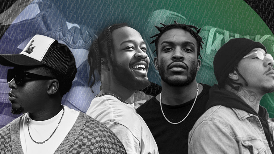
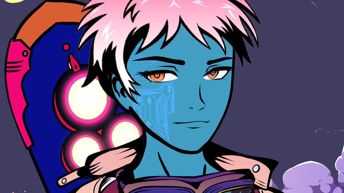
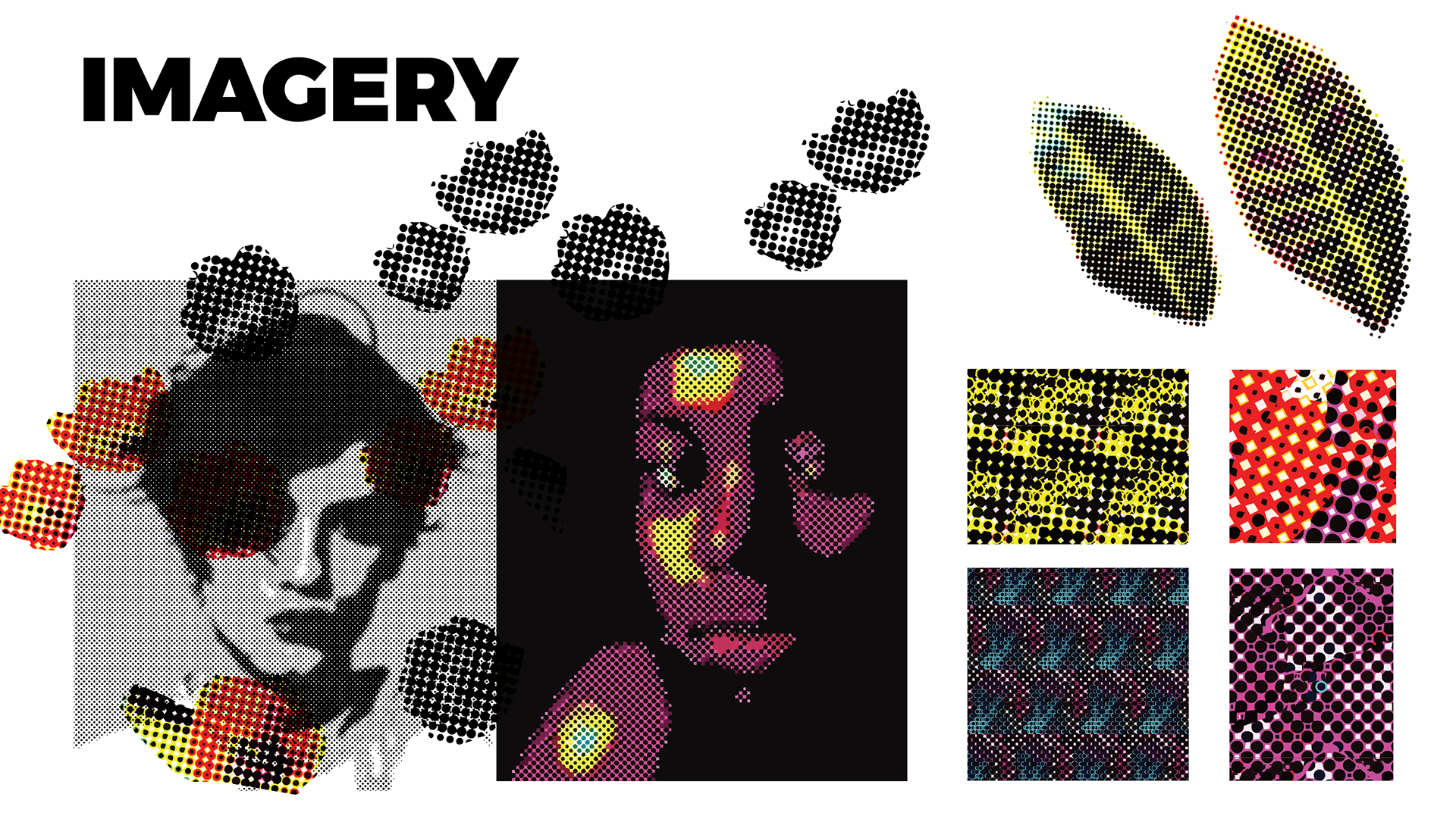
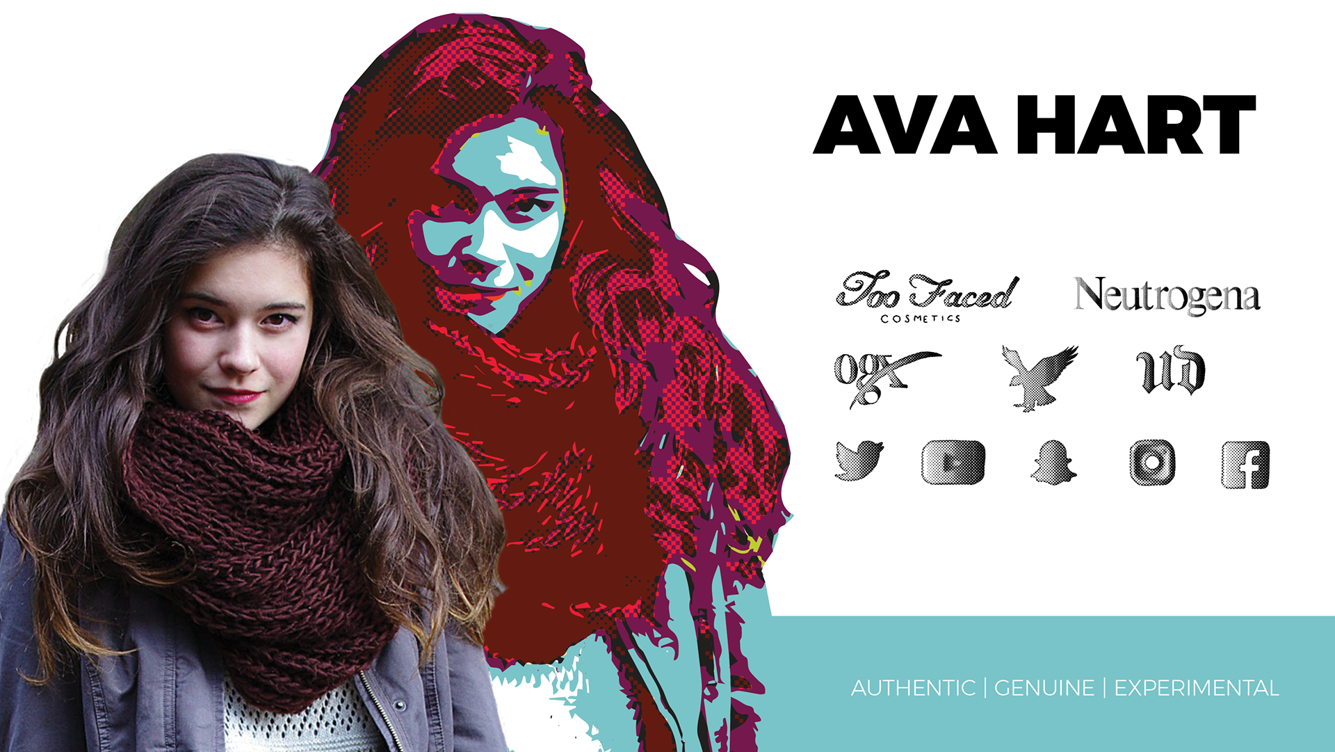
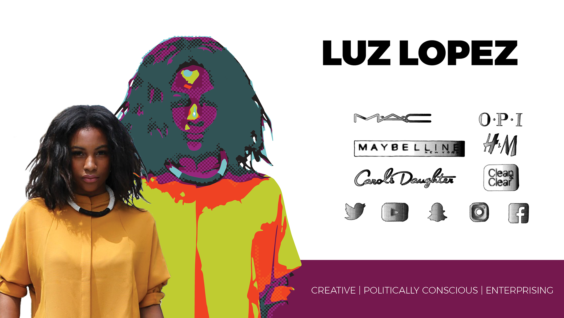
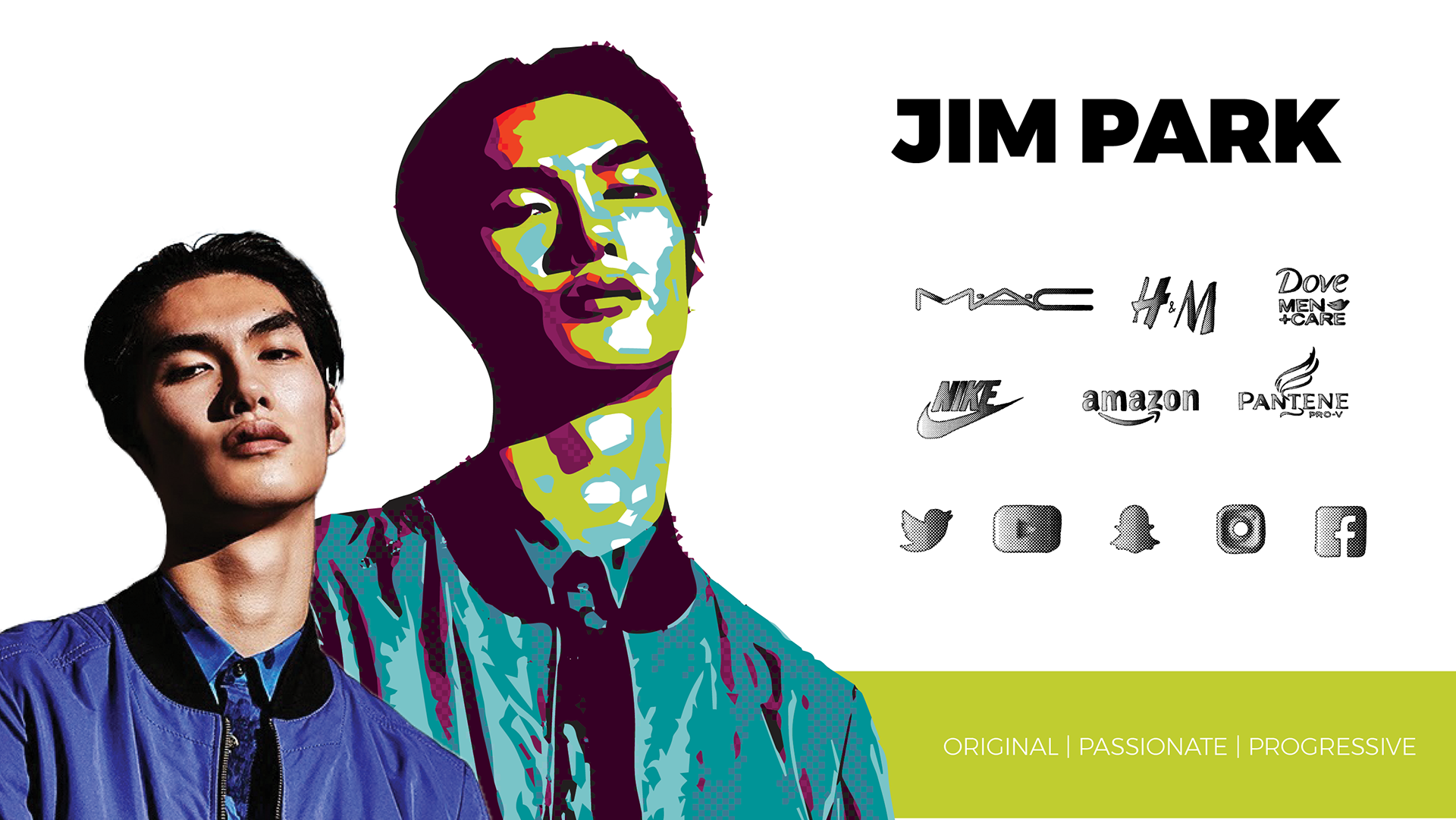
Since the demographic that this product is intended for is Generation Z and the end tail of Millenials, the research I conducted informed me that the best way to communicate with them is via social media and online, or cell phone technology. Their lives revolve in a real vs fantasy world where that line gets blurred quite often. Their lives are both online and also physical. I went with a fantasy world theme with people of all backgrounds coming out of the pictures from half tones.
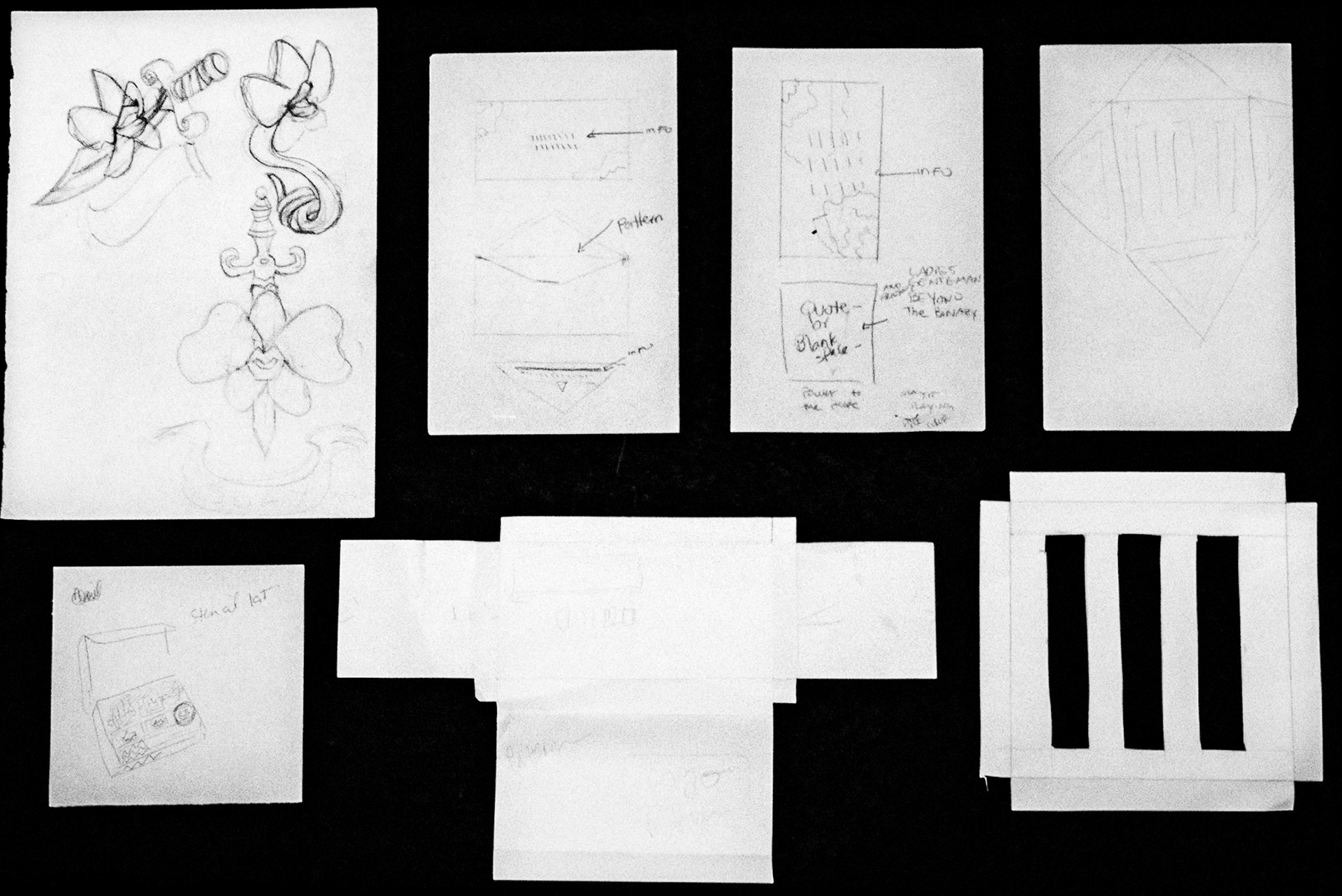
LOGO
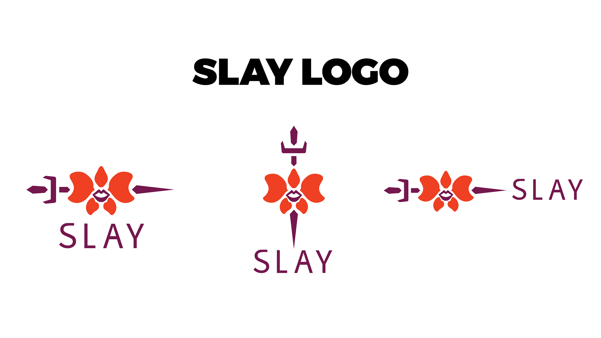
The logo is an integral part of the Slay brand and it has three variations. One vertical and two horizontal. It is a moth orchid with lips in the center and a dagger going through it. The moth orchid with a mouth represents the consumer and the dagger represents their mythical weapon. You can say they are a “Wonder” person. They are powerful and they can Slay.
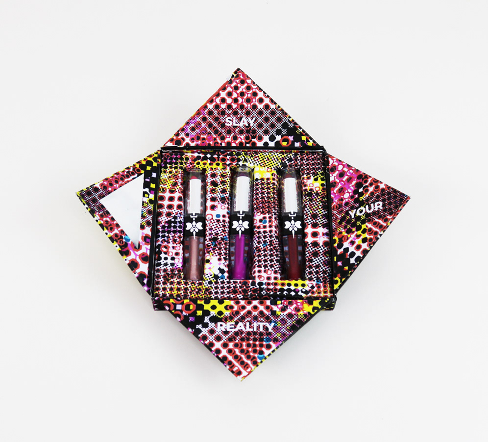
PACKAGING
Packaging is what is making makeup sell nowadays, so making the package look different is key. Also, making sure that it speaks to the demographic as well is imperative. I wanted the consumer to experience breaking the barrier of reality vs fantasy. I wanted them to wonder what they were seeing – if it was a face or not – and have that sense of wonder. The faces on the packaging are of a trans woman, an Asian man, and a teen femi. The colors are still on-brand but the consumer would not be able to associate the packaging with any gender, which is exactly what we are trying to accomplish with Slay.