THE CHALLENGE
To Redesign OPPD’s Power Outage Map to improve customer Service and to transform the outage experience by providing timely and accurate information that customers trust.
We were to work from the following customer story:
“When my lights go out I don’t know what’s going on – why is it off and when will it be back on? When I don’t have power I have to make other arrangements and it disrupts my life – I need to plan!
When my lights go out while I’m at work it forces me to call OPPD for an update because my kids get home before me during the week. It doesn’t happen often but when it does it’s frustrating…I don’t have any information!”
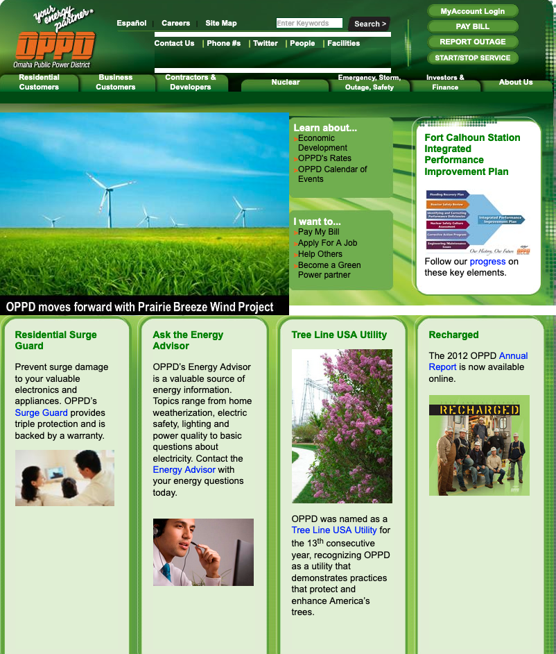
OPPD Website before
PROCESS
I noticed that their branding was not consistent. I made sure to have their branding elements implemented throughout their website.
I researched other energy companies that were top-rated in the nation and also internationally. What they all had in common was the ease of use. Everything was intuitive and finding information on outages was simple and fast.
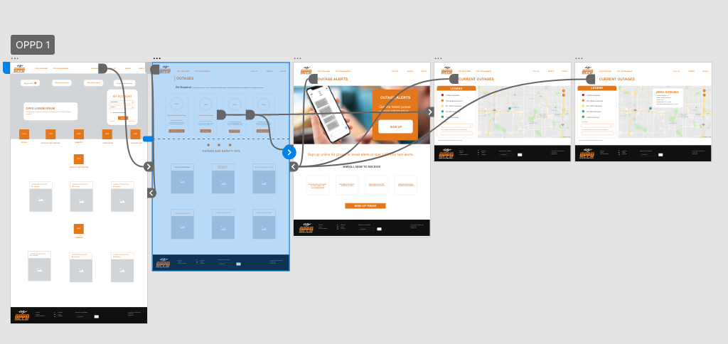
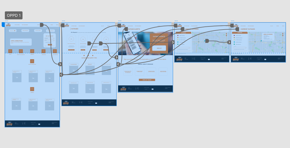
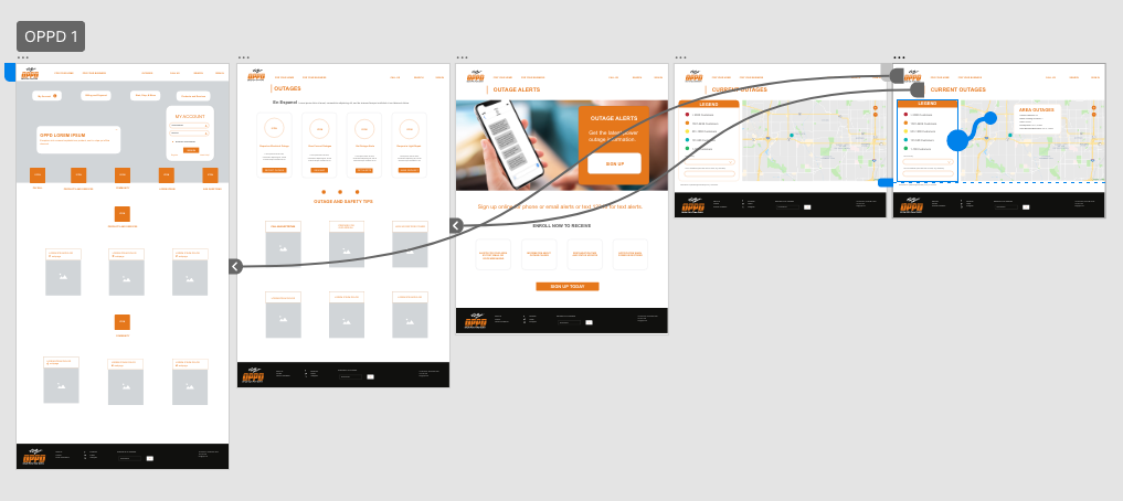
With that in mind, I created a UX map that would be easy for customers to follow.
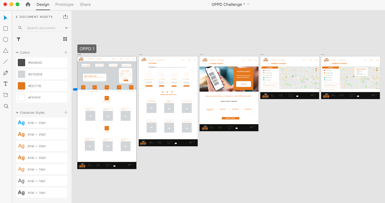
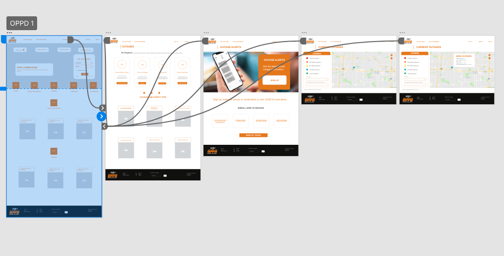
SOLUTION
By creating this system, the customer could get information on outages faster. Customers would have access to updates via text messaging, OPPD app, and via OPPD website. The navigation has an ease to eat and it is intuitive. It makes the experience seamless.